The Thinker's Garage Pondering Automotive History, Design and Culture

Celebrating the Volkswagen Up!
I am often asked what my favourite new car design is. My response that it is the base model Volkswagen often raises eyebrows, but there are plenty of reasons why the Volkswagen Up! is one of my favourite new cars.
In an age where car design is often not much more than simply styling, the level of detail that has gone into the Volkswagen Up!’s design is refreshingly thorough. The constraints of a brief that require a car to be both small and inexpensive have led to some inspired thinking in the past: the Fiat Nuova 500, Citroen 2CV and the Mini are obvious proof of this. Interestingly enough, all three of these cars could be considered the product of one man’s focus and creativity. Sure, others may have been involved in their development but Dante Giacosa, André Lefèbvre and Alec Issigonis stand proud as the creative forces behind the 500, 2CV and Mini. The Up! was championed by Walter De Silva and the fact it was the product first and foremost of design thinking is one of the reasons why it is so successful, and Mr De Silva and his team at Volkswagen should be proud. In this case, design runs deeper than simply surfacing and interior trim and the Up! is so much richer for it.
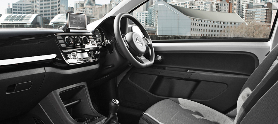
At first glance, the interior of the Up! is impressive for such an inexpensive car. The controls are nice, the plastics are good quality and it is not too grey and depressing, a fate suffered by all too many entry level vehicles. On further inspection though, a lot of the features that contribute to making the Up!’s interior as unique and pleasant as it is also double as ways to save costs. While many small cars use cheap, thin feeling plastics for sections like door cards, the Up!’s door card is small and framed by door metal, giving the interior a body coloured splash of brightness and reducing its size and thus production costs. The centre console is small but good quality and is mounted on the nice interior carpet. This adds a softer feel to the interior and helps create a sense of space in what is quite a small cabin. The textiles are playful, the controls simple and utilitarian but well executed and the overall perceived quality is excellent as one might expect from Volkswagen.
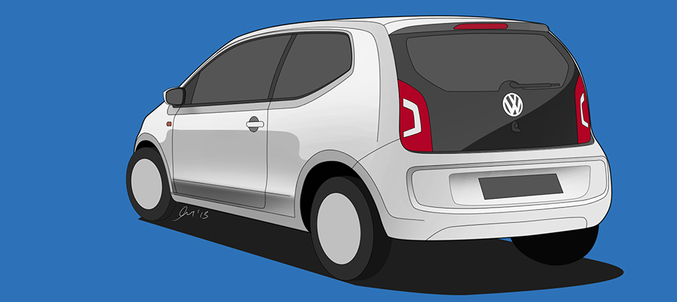
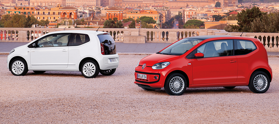
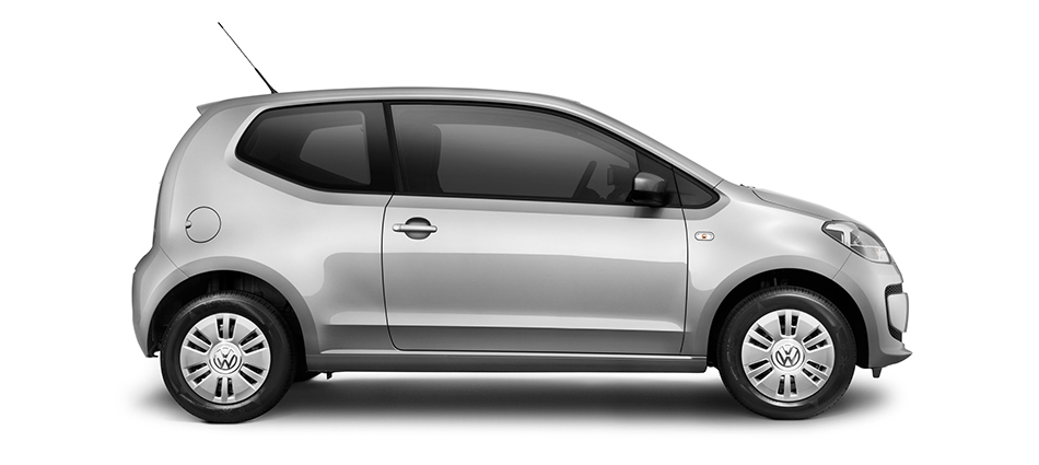
The exterior too is a delight. The Up! shies away from modern trends of over styling and brands attempting to portray vehicles as something they are not. It is honest, efficient and extremely well-executed. Its face allows us to instantly recognise it as a Volkswagen, while avoiding aggression and the trap many small cars fall into of trying too hard to be cute. The chamfered two-box shape of the Up! looks pleasingly simple but has clearly had a lot of effort placed into getting the proportions correct. There is just enough going on with the surfacing to make the car visually interesting without being busy and I expect the car to age incredibly well because of this. Undoubtedly the biggest design highlight is the glass tailgate section, which adds a high quality and unique styling feature which works especially well on light coloured Up!s while being efficient to produce and durable.
In these times of financial austerity and environmental concern, cars like the Volkswagen Up! are very relevant. The Up! is what happens when you take the type of attitude that produced some of the great classic cars and combine it with modern design practices, materials and technologies. In a world where the transient nature of pop culture rules and our icons are often fleeting the Up!’s ability to be creative, different and relevant while remaining honest and timelessly simple is something that should be celebrated.


